
November 28, 2009
Signalnoise Broadcast #3
Another interesting talk by James White, great to see the development of his work throughout the last couple of years.
I have found these broadcasts a great opportunity to get to know the designer himself, which is just as important as the work itself, you can really see where his thought processes and inspiration arise from, and the interesting part is that this process is different for everyone.
November 11, 2009
Werkplaats Typografie
 Interesting approach for displaying a portfolio of works, making it more interactive to the user, allowing them to move bits around the webpage and viewing the different works.
werkplaatstypografie.org
November 09, 2009
Quarry Workers: onlab


"The order and direction of the sheets within the 6 different issues are placed in varied sequences. Therefore, the documentary portraits of the quarry workers are always positionned differently. It creates diverses picture compositions."
"Photographs of quarry workers, published in 6 different editions, assembled in 6 variable configurations and serially numbered."
Sometimes black is all that is needed.
Quarry Workers on onlab | www.onlab.ch
Conspiracy Magazine: Livia Foldes
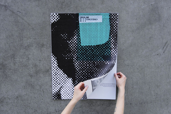
"This large-format magazine attempts to uncover the visual language of paranoia, employing cheap paper, grainy surveillance shots and palpable outrage."
The use of black tone throughout the magazine adds to the overall appeal. Very interesting use of colour on the front cover and intentional enlarging and cropping of photos to reveal only parts throughout.
Conspiracy magazine on liviafoldes | liviafoldes.com
November 08, 2009
Channel 4 3D Week

Not sure how this will go down, should be pretty interesting at least. Chance to see Derren Brown, movies, The Greatest Ever 3D Moments and others in 3D.
3D facts | www.channel4.com/programmes/3d-week
November 04, 2009
Toormix


More of this monotone stuff, the red being the only colour really brings it out the paper. The positioning of the type looks completely fine even though it is over the image.
http://www.toormix.com/
Alistair Webb


 Love the use of just two colours and overlapping of the type over the colours and images on these.
Simple method of a portfolio site also, just laying out everything in small thumbnails for everything to see and also clicking for a closer look.
Website: http://alistairwebb.com/
Found over at: http://www.bitique.co.uk/
Made By Heath Killen


Wide range of experimental collages, relations made between objects that normally would be seperate. Interesting stuff.
Flickr: http://www.flickr.com/photos/illuminationink/
Website: http://madebyhk.com/categories/32/search_type/and/
Subscribe to:
Posts (Atom)